Another month of books, another month of book covers. Here are my favorites from September:
No way to avoid putting this image of Lucrezia de' Medici on the cover, but the blunted cutouts—and the perfectly imperfect way they reveal the text—add the perfect dash of interest and modernity to the portrait.
Here's a cover that has it both ways: it reads both as nighttime neon and, due to the texture of the illustration, something much earthier and softer. A very good balance.
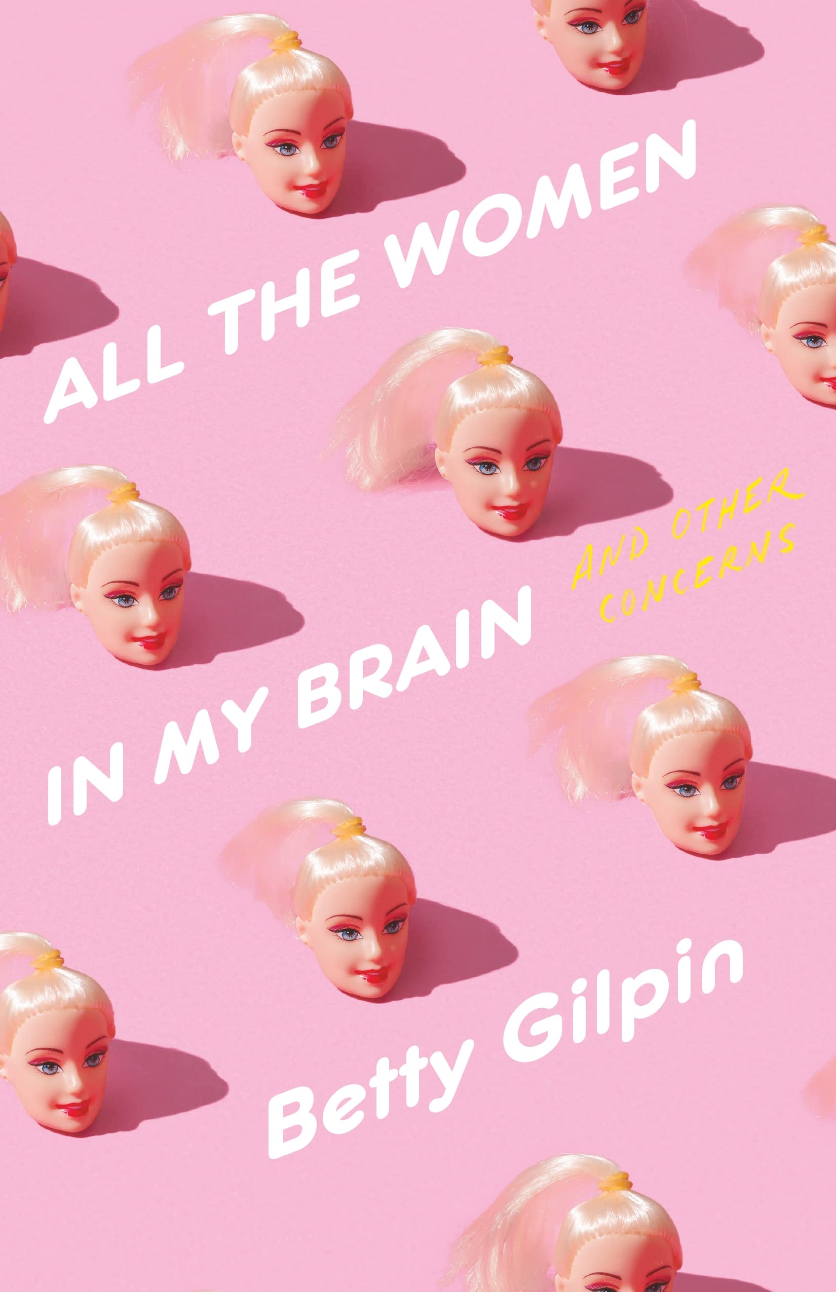
Now this is just a good idea—and though it's odd to put it this way, the expression on the decapitated Barbies is pitch perfect.
This would be a pretty straightforward Big Book Cover (big text, softly patterned background, minimal illustrative element) except for the brilliant matchstick detail. The fact that it's burning the letter above it is just next level.
A case of a good, simple idea, masterfully executed.
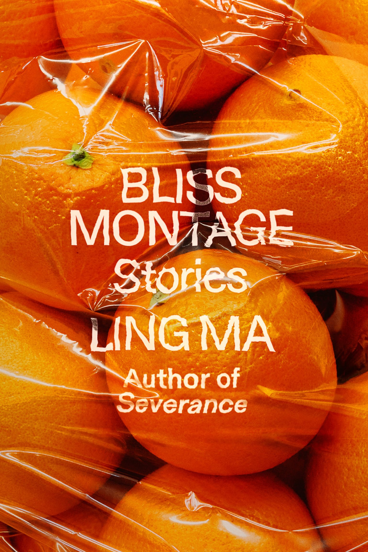
Ling Ma, Bliss Montage (cover design by Rodrigo Corral; FSG, September 13)
This has got to be the most scrumptious book cover of the year. Even though I know it's a flat image, I can't help but want to touch it.
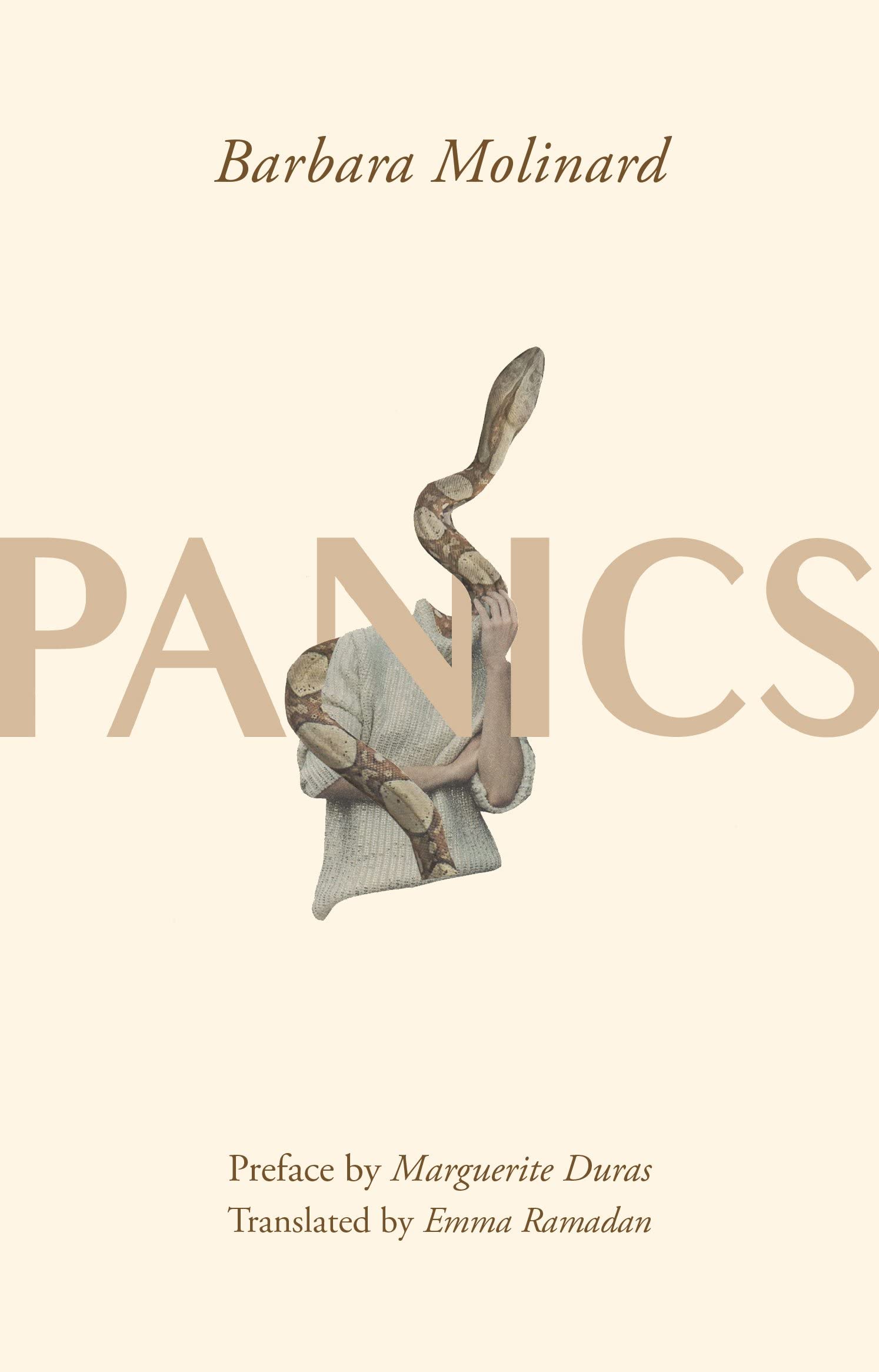
Barbara Molinard, tr. Emma Ramadan, Panics (cover design by Sukruti Anah Staneley, cover art by Rozenn Le Gall; Feminist Press, September 13)
This reminds me of another recent cover I loved, for Lina Wolff's Carnality, both of which take the sexist headless/faceless woman cover trend, turn it over, and make it cool again.
In its striking simplicity, this cover reminds me a lot of those gorgeous Italo Calvino backlist redesigns by Peter Mendelsund and Oliver Munday.
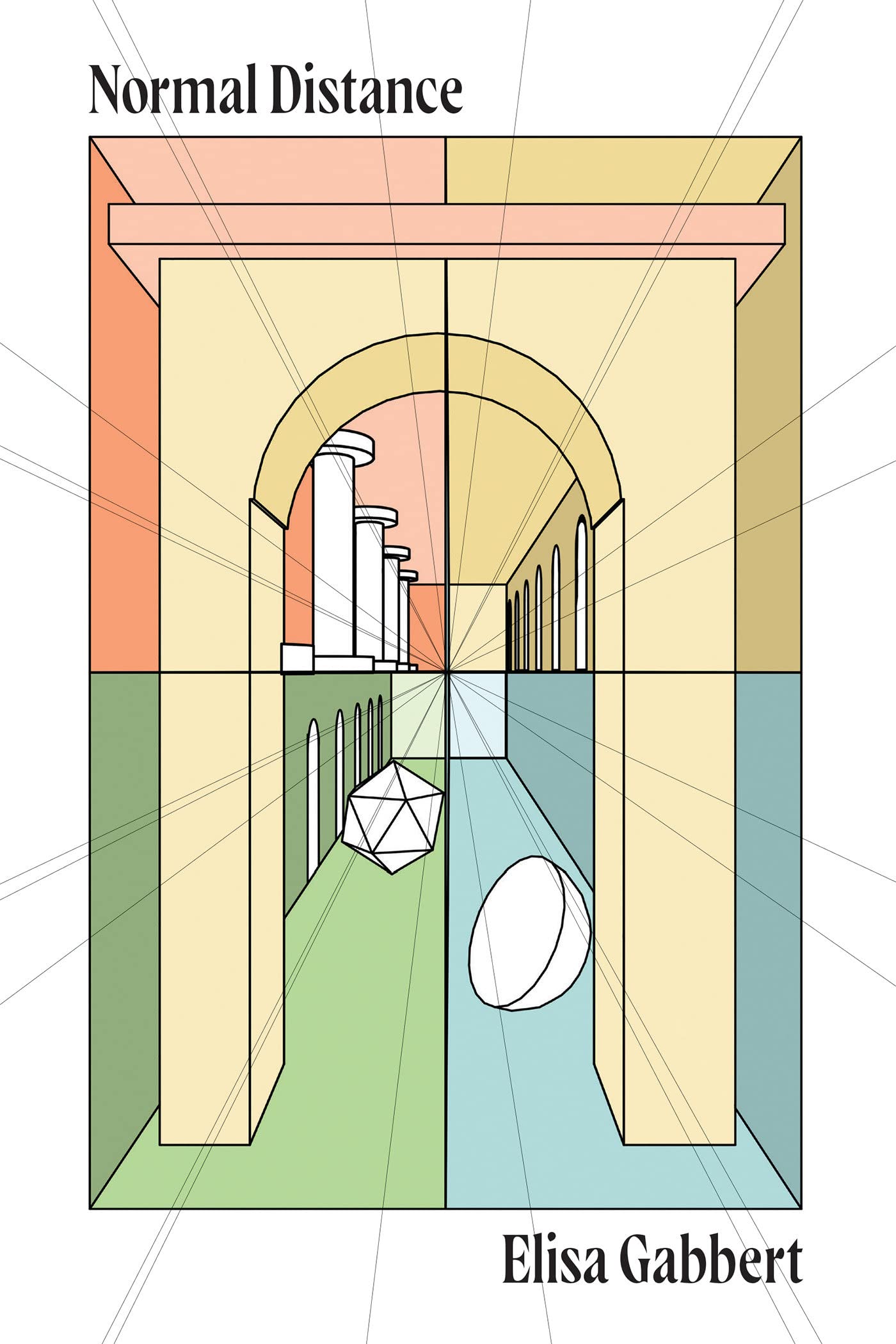
Elisa Gabbert, Normal Distance (cover design by Michael Salu of House of Thought; Soft Skull, September 13)
From composition to color palate, this is one of the most refreshing, non-book-cover-ish book covers I've seen in a while.
Gorgeous use of illustration and text.
I don't know what it is, but I like it. (Actually, turns out I'm not supposed to know what it is. "There isn't a single image that could succinctly capture all that the conversations touched on in this book, so I wanted the cover to be open to interpretation," Merto explained. "It could be a halo or a ring. It could be an entrance or an absence. A moon, or a sun, or an ouroboros. My desire was to create something iconic and timeless.")
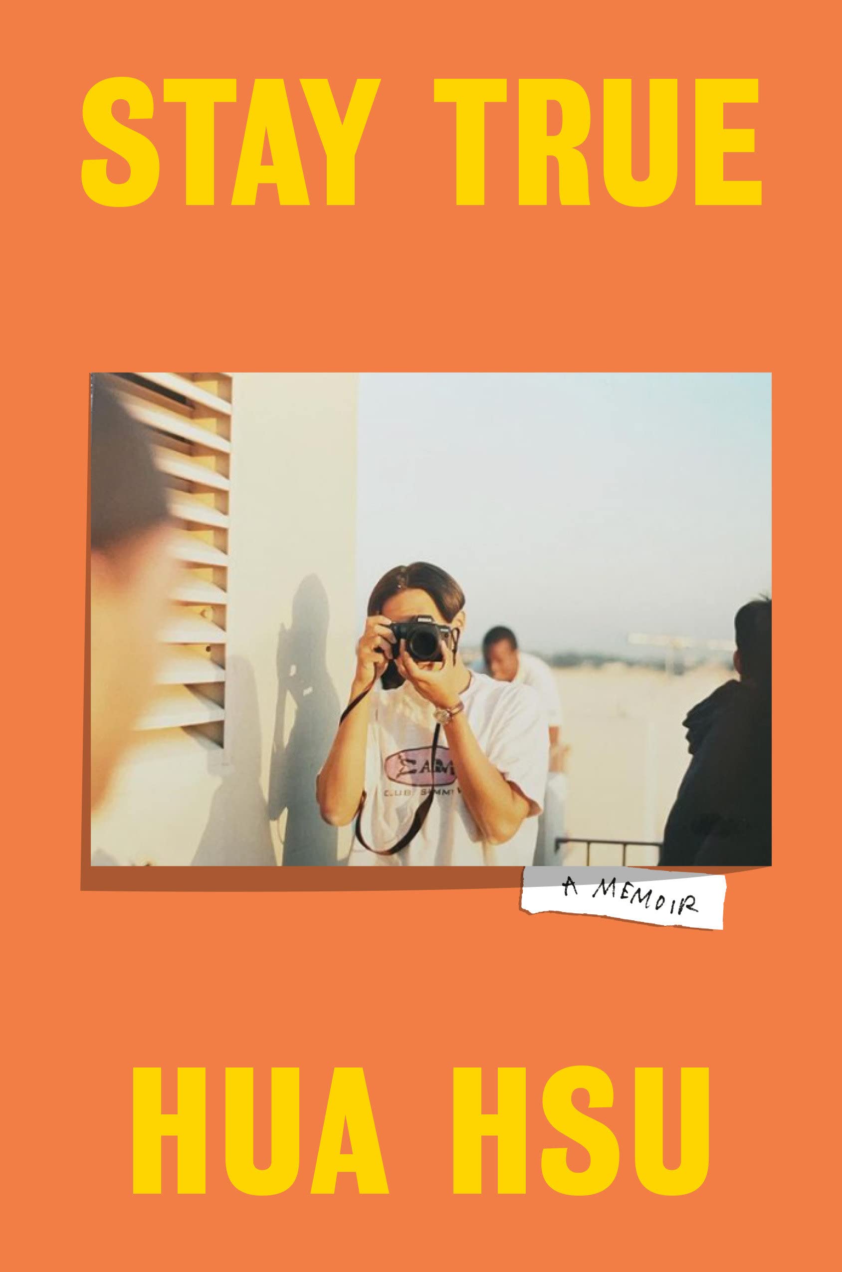
Hua Hsu, Stay True (cover design by Oliver Munday; Doubleday, September 27)
Perfect, elegant simplicity, elevated by the dimensionality of the photograph and the color choices.
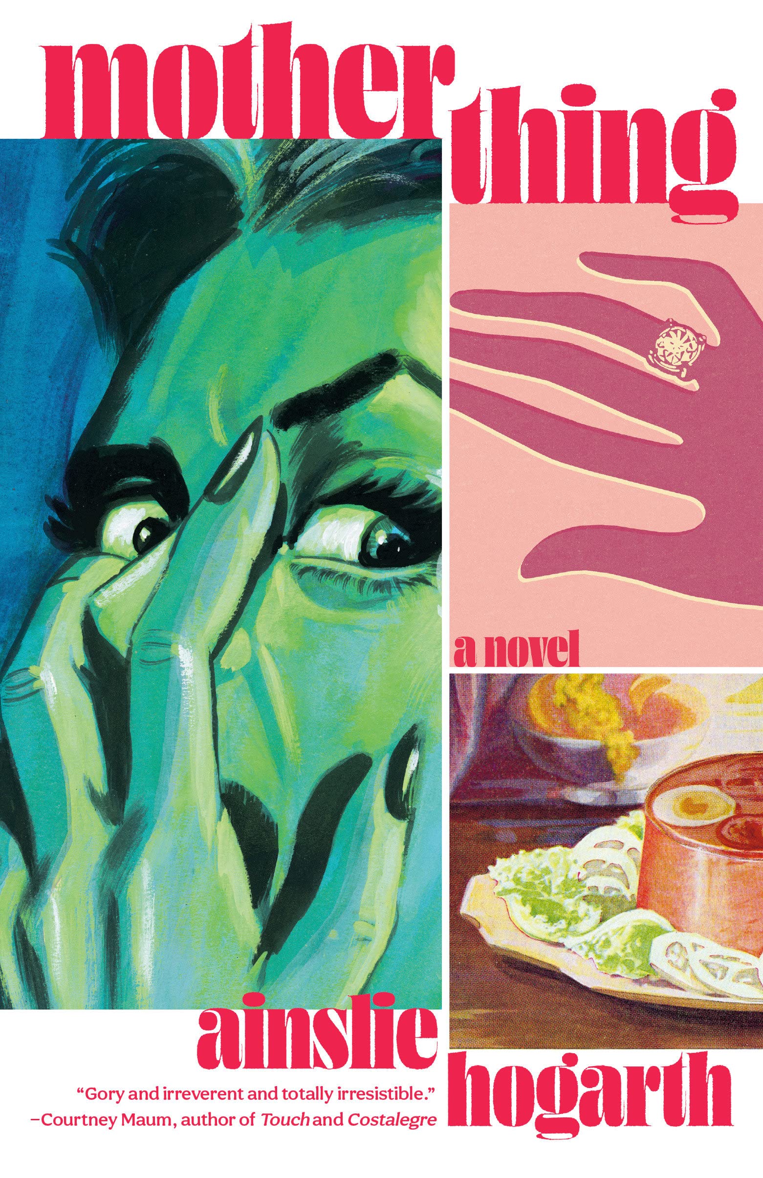
Ainslie Hogarth, Motherthing (cover design by Mark Abrams; Vintage, September 27)
Vintage comic delight!
What an interesting idea, especially paired with this cover—I've never seen two portraits juxtaposed in quite this way. Plus, I'm charmed by the jangly stacked text.
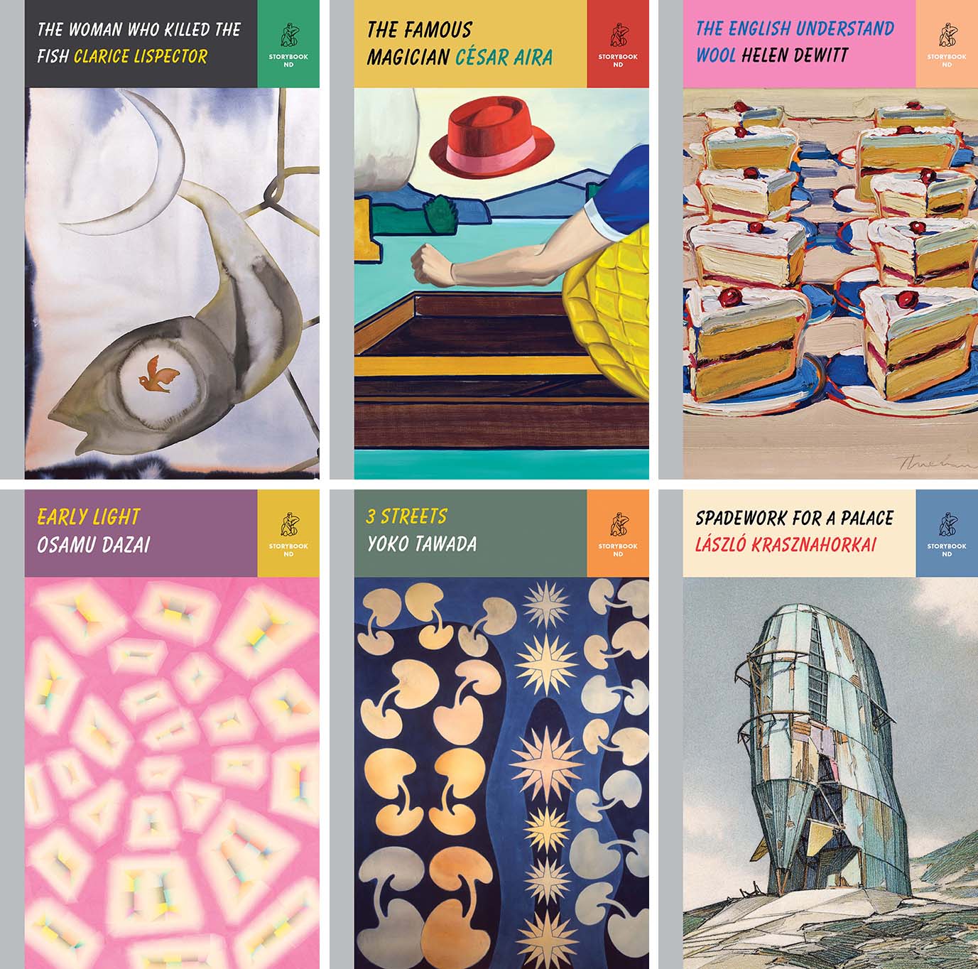
The Storybook ND series (designed by Peter Mendelsund; New Directions, September 27)
This new series of slim hardcovers from New Directions, each cover featuring work from a contemporary artist, "aims to deliver the pleasure one felt as a child reading a marvelous book from cover to cover in an afternoon." Each one is scrumptious.








No comments:
Post a Comment