This first appeared in Lit Hub's Craft of Writing newsletter—sign up here.
I like to think I'm spectacularly good at having a bad time.
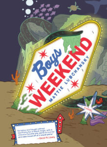
A few years ago, I was asked by my best friend from college to be his best man. What an honor! Except I was in the middle of early transition and not out to this particular group of guys yet. The bachelor weekend came quickly, in Las Vegas, where I suffered a rather severe existential break—mostly of my own making. I was too afraid of making a scene or running into real prejudice, so I chose to forgo any difficult conversations in lieu of simply boymoding. One bright side—I returned home with the kernel of an idea for a story that would eventually become my graphic novel, Boys Weekend.
For me, the visuals in this book were inextricable from the premise. When I'm editing other peoples' comics work, the first thing I like to ask is why is this a comic? Either what about this story can only be told visually, or what about this story will a visual element enhance? Not everything needs pictures. A comic can communicate so much to a reader so quickly—people can read work that's taken years to accomplish in mere hours—but a visual story, for me, is something more experiential.
What I mean here is, comics present a very intimate experience between author and reader. It's interactive—the pages are carefully constructed so I'm leading the viewer around where I'd like their eye to go. The page spreads are planned so the reader can choose—or not—to turn the page and keep reading at a tense moment to see if it's diffused in ways either humorous or terrifying. Since I'm in charge of where that page ends and on which panel, I can direct the reader exactly where I want them to go.
I was thinking a lot about Ursula K. Le Guin's The Dispossessed when writing this book—not a comic, I know—but something that always struck me about that novel was the feeling Le Guin extracted of someone experiencing capitalism for the first time to a readership that had basically only ever experienced it, in a way that was original, and funny, and never heavy-handed. She seemed to simply say: You live like this?
My ideal reader of my work is Trans—but reading is a universal experience and I wanted to present an emotion similar to the overwhelming way the world can appear to someone newly out. It's a very unmooring time in one's life—if gender isn't real, what else isn't? For me, the way to do this was visually—bright colors and a frankly staggering number of Boys. A visual story here makes that brightness and that social suffocation that much more inescapable.
The other book that had a feeling I was trying to chase was Margaret Atwood's Oryx and Crake. A lot of people tend to cite The Handmaid's Tale in terms of historical foresight, but for me Oryx is far more terrifying in its accuracy: a tech oligarchy, sunken cities, and constant surveillance in a world where objective truth is nonexistent. The thing that really stuck with me from that book was the nature of business and how it was done. There's always something horrifying happening just under the surface of any wonderful new tech innovation, and I was hoping to generate the same sense of terror in El Campo, the setting for Boys Weekend.
In a place where our tech overlords are allowed to do whatever they'd like (even more so than our current time and place), what fresh misery could they inflict? What deathtraps could they market as not only necessary, but fun? I wanted the terror of it to creep in at the edges. The visual medium here once again comes in handy—I can populate the world with the most appalling businesses and amusements imaginable in the background of every scene. Here again this is experiential, not drawing attention to them per se, but the world is swimming in it.
A great synthesis of the qualities here in a visual story is the design of the setting in Ezra Claytan Daniels and Ben Passmore's excellent graphic novel BTTM FDRS. It too is a satirical horror story that touches on how identity and capitalism can affect a friendship—and at the center of it all is a totemic figure - the building the characters live in. It looks familiar enough, like many buildings you might see in a formerly industrial area of a gentrifying city—but something about it mesmerizes. Something just uncanny enough to draw the eye every time any element of it is on the page, but for reasons unknown. The world itself is hostile, and unusual, but all too mundane.
Comics are able to drop readers directly into a lived-in space. They're the best medium I know for putting the reader somewhere completely outlandish, asking them to buy in with you, and telling a human story with it.
_______________________________

Boys Weekend by Mattie Lubchansky is available now via Pantheon Books.
No comments:
Post a Comment