Emily Temple posted: "Another month of books, another month of book covers. Here are some favorites from the first few weeks of the year. The emotional, almost claustrophobic effect of the text over the image (Vase of Flowers by Jan Davidsz de Heem) is a perfect fit for" Literary HubRead on blog or Reader
Another month of books, another month of book covers. Here are some favorites from the first few weeks of the year.
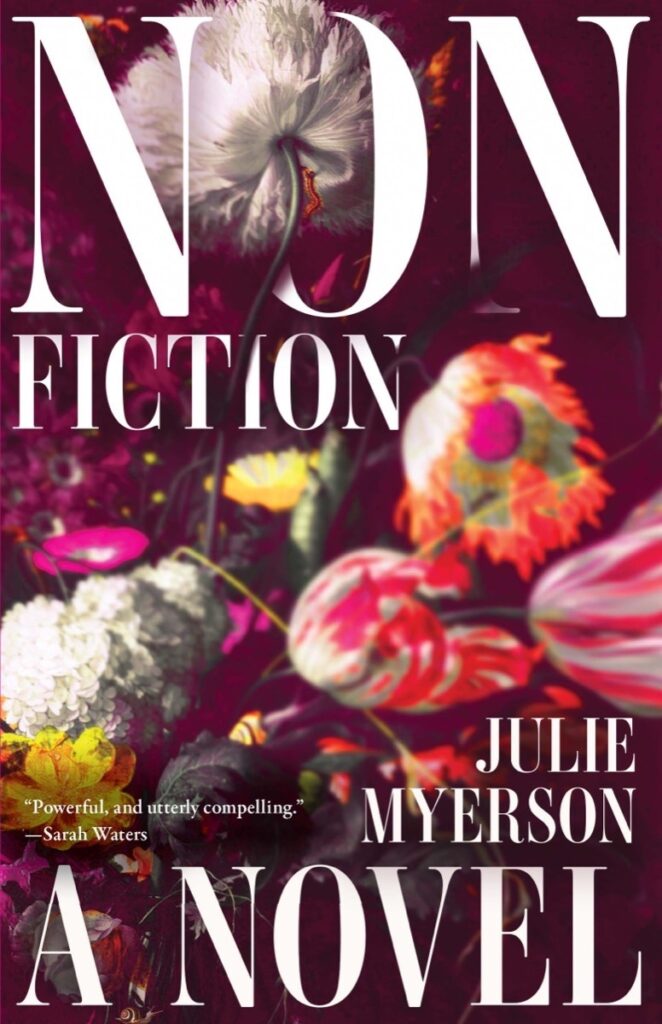
Julie Myerson, Nonfiction; cover design by Beth Steidle (Tin House Books, January 2)
The emotional, almost claustrophobic effect of the text over the image (Vase of Flowers by Jan Davidsz de Heem) is a perfect fit for this novel. And the big "NON" just gets me.
I'm always a sucker for that Kelly Green, and also for books on books, and also for infinite regress. The cut off text at top and bottom—to show us that we're just looking at any random moment in the progression—is brilliant.
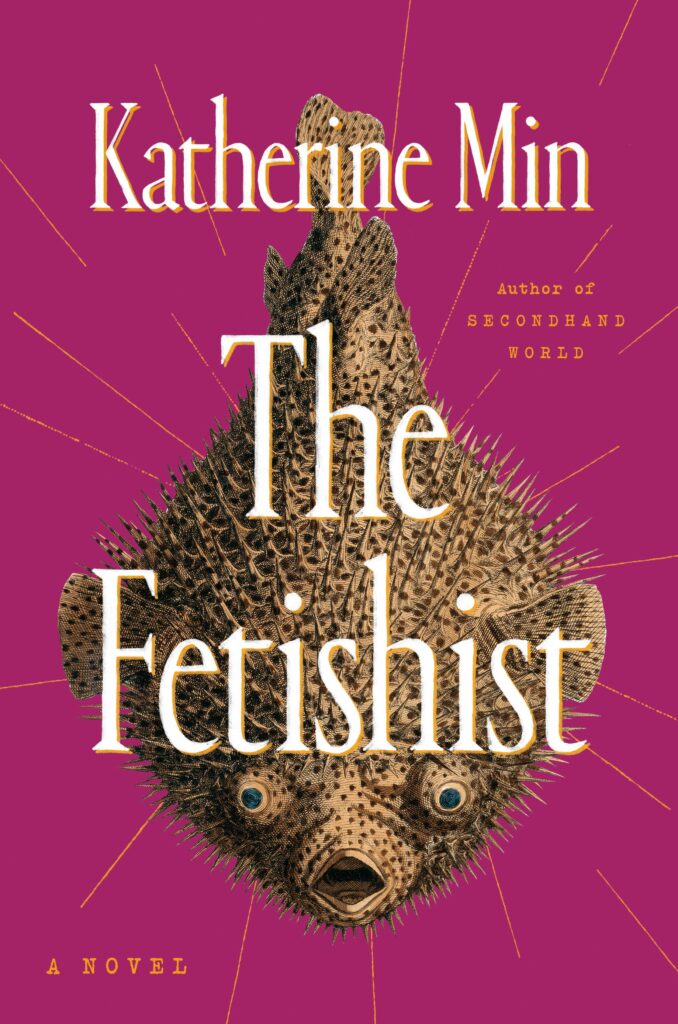
Katherine Min, The Fetishist; cover design by Stephanie Ross (Putnam, January 9)
An intriguing combination of title and image if ever there was one.
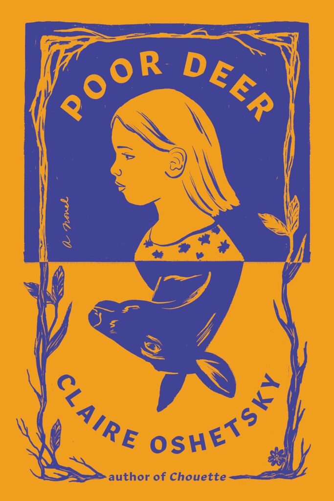
Claire Oshetsky, Poor Deer; cover illustration and design by Vivian Lopez Rowe (Ecco, January 9)
I am not at all sure what is going on here—physically, I mean—but the color choices pop and the overall effect is very striking.
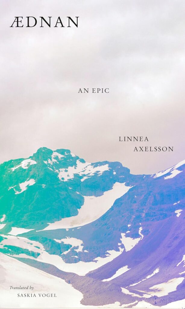
Linnea Axelsson, tr. Saskia Vogel, Aednan; cover design by Linda Huang (Knopf, January 9)
Like a deep breath of cold, fresh air. I love the way the text trails down from left to right.
Marie-Helene Bertino, Beautyland; cover design by Thomas Colligan (FSG, January 16)
So much is done with such simple elements; I love the juxtaposition of the block text and austere color blocks against the winking script orbiting the stars.
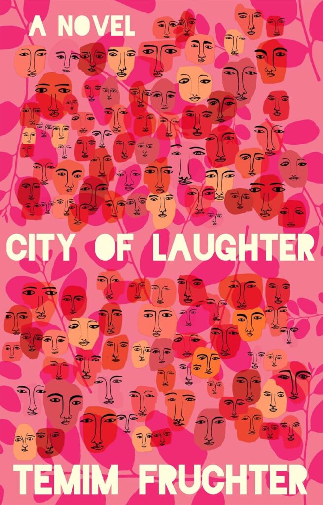
Temim Fruchter, City of Laughter; cover design by Kelly Winton (Grove Press, January 16)
A pink cover, a pattern cover, a weird and lovely cover.
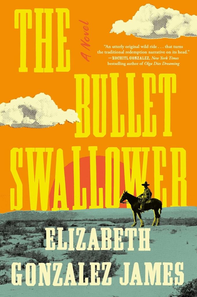
Elizabeth Gonzalez James, The Bullet Swallower; cover design by David Litman (Simon & Schuster, January 23)
The composition is gorgeous and perfectly balanced, but it's the quality of the details—the cutout halftone clouds, the yellow highlights on rider, etc.—that bring this cover to the next level.
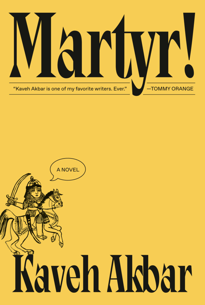
Kaveh Akbar, Martyr!; cover design by Linda Huang (Knopf, January 23)
"Despite its heavy themes, I found Akbar's novel to be insanely funny," Huang told Literary Hub. "I cackled many times while reading the manuscript. More than anything, I wanted to evoke this unique tragi-comedic tone on the cover. One of the central, recurring images is this Iranian 'Angel of Death' warrior. I experimented with scale and ultimately found the warrior in miniature to be most striking, with 'a novel' set in a deadpan speech bubble. I was also lucky to stumble upon the perfect decorative typeface to activate all that negative space. To me, humor is one of the most alluring qualities in a book (and really, in life) so it was an absolute treat to work on Akbar's novel."
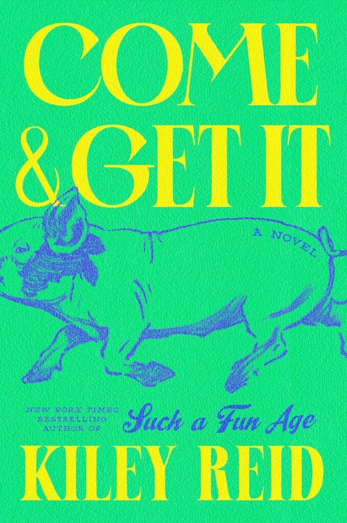
Kiley Reid, Come & Get It; cover design by Vi-An Nguyen (Putnam, January 30)
Another very good green—it pops on both bookshelf and screen—on a cover that is low-key very funny.


No comments:
Post a Comment